Wednesday, December 2, 2009

Lab #8: Census 2000/2010

This lab deals with the 2000 Census and projecting different race populations onto a map of the United States at the county level. Below are detailed descriptions of each map, followed by an ending statement and a summary of my overall impressions of GIS.


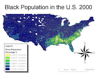
This map shows where the highest concentration of African Americans is in the U.S., and it's clear that the highest percentages occupy the Southern, Southeastern, and Eastern portions of the map. The highest percentages (between 53 and 85 percent) are located throughout Louisiana, Mississippi, and Alabama. I believe that in the 2010 Census, due in large part to Hurricane Katrina in 2005, the percentages will not be as concentrated in the South as they are now. I believe that a 2010 Census map will reflect blacks' inability to return to the South, based on certain socioeconomic factors brought upon by the hurricane; a 2010 map might show more even dispersion of the African American population in the Southern and Eastern portions of the map, and perhaps, more African Americans will appear in the middle part of the country.
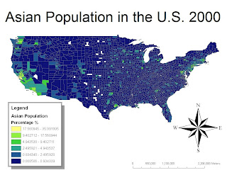


This map shows that the highest percentages of Asians, between 18 and 36 percent and between 9 and 17 percent, appear autocorrelated, or clustered, in certain spots along the map. These clusters are most predominate in Washington, in California's Bay Area (San Francisco), along the East Coast, and in a small portion of Texas. These clusters appear where the country is also most densely populated overall. I believe that a 2010 map of the Asian population in the U.S. will show a higher percentage of Asians in these concentrated Asians, because this is what I have read about 2010 census predictions.
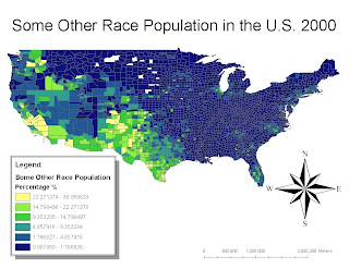


This last map shows the "Some Other Race Population" in the U.S., and this category was created for people who felt that they were unable to identify with the races listed in previous census studies. This category allows people to identify themselves as Moroccan, South African, Belizean, or a Hispanic(for example, Mexican, Puerto Rican, or Cuban). It's apparent that this group is highly concentrated throughout Texas and Southern California, and I believe this is due in large part to the influx of immigrants into the U.S. from Mexico (and elsewhere) who find low-wage jobs in the Southwestern and Western portions of the Country. Again, I believe that a map of the 2010 Census would reflect a more concentrated population of the Some Other Race Category, but this population won't shift too far from where it is now (in terms of location).
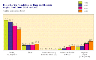


In order to reassert my predictions about the 2010 Census, I visited the U.S. Census Bureau website and found this chart. It predicts the population growth of various races from 1990 to 2050. This chart shows that the percentage of whites will steadily decrease, while the black, Asian, and Hispanic groups will increase. The greatest population growth might be seen in the Hispanic group, and the U.S. Census Bureau bases this prediction on a number of socioeconomic factors which include, but are not limited to: fertility/birthrate, quality and availability of health care, and immigration.

At first, I thought that this class was going to be solely based on maps and geographic locations of various places, but we have gone beyond that. We learned how maps can help policy makers make decisions and how maps can aid doctors and scientists in slowing or predicting where disease will occur. The most interesting thing that I learned from this course and from GIS is that anyone can make a meaningful map that can ultimately serve a higher purpose; maps can help better our understanding of the world in which we live.

Tuesday, November 17, 2009

Week 8, Lab 7: Mapping the Station Fire in ArcGIS


In this lab, I wanted to create various maps depicting the Station Fires from the end of August to the beginning of September in LA County and how the fire may influence certain institutional aspects of society, such as hospitals and schools. I also wanted to show how certain natural aspects of LA County, such as debris basins, parks, and significant ecological areas may be affected by the fires.

In order to do this, I created a reference map by extracting an LA County DEM from the USGS Seamless Server website and layered a boundary of LA County that I found from the Department of Public Works website on top. From there, I added significant highways and a few nearby cities to give the viewer a better idea of where the fires occurred. Finally, I layered the station fire information that was downloaded from the LA County GIS website.

First I wanted to layer LA County's hospitals on top of the county boundary to show which hospitals were closest to the fires. The map shows that of all the hospitals in LA County, only a few are at risk. These at-risk hospitals are labeled on the map. Fire could have a significant impact on social health because if hospital care is not readily available to its nearest citizens, those people must travel further to receive care. I also wanted to layer LA County's public elementary, middle, and high schools on top of the LA County boundary to show which schools were closest to the fires. One can see in the image that there is a significant amount of at-risk schools along the southern border of the station fire. Fire could have a significant impact on education because kids who are put out from school may fall behind in their studies; others may have to transfer to other schools temporarily, which could affect their social circles.


I also wanted to show certain natural aspects in LA County, such as debris basins, parks, and significant ecological areas, and how they may be affected by the station fires. In the debris-basin map, one can see that there are many debris-basins that line the southern border of the fires, just like the map with the schools. These basins are important and if the fire destroys them or dirties them with ash, there could be a severe, negative ecological impact. Concurrently, if one looks at the map depicting the LA County Parks, one can see that the parks most susceptible to fire are labeled. Parks are unique because they have natural and social implications. If a park is destroyed by fire, citizens would lose a public place of recreation and a natural place to visit in the busy city. Finally, if one looks at the map with the significant ecological areas map, one can see that the areas most susceptible to fire are labeled. These ecological areas are important because they are reserved specifically to protect biotic diversity. If these areas are destroyed by fire, we would potentially lose much of our natural biotic diversity.


In summary, I have come to realize that these station fires could potentially have great sociological and ecological impacts on LA County. If schools and hospitals are engulfed by the fires, then children would have to temporarily sacrifice their education and patients would have to be transported elsewhere. If debris-basins, public parks, and significant ecological areas are destroyed by the fires, there could be severe negative impacts on our ecosystem and overall well-being. This is why it's important to know where these places are in relation to the fires, as well as how the fire progresses over time.

Works Cited

Archive for Fire. Los Angeles County Enterprise GIS, 2 Sept. 2009. Web. 21 Nov. 2009. .

GIS Data - Available Layers. Los Angeles County Department of Regional Planning, 19 Jan. 2005. Web. 21 Nov. 2009. .

Mapshare: UCLA's Spatial Data Repository. UCLA, 2008. Web. 21 Nov. 2009. .

"The National Map Seamless Server." The National Map Seamless Server. U.S. Department of the Interior, 16 Nov. 2009. Web. 21 Nov. 2009. .

"Spatial Information Library Site Options Page." Dpw.lacounty.gov. Web. 21 Nov. 2009. .

Tuesday, November 10, 2009

Week 7, Lab 6: DEMs in ArcGIS

I selected a mountainous region outside of the East Bay in Northern California. I chose this location because I am from the Bay Area and was interested to see what a 3D elevation model would look like (of the region that I am from). The extent and datum information is listed below the 2 maps, taken from the USGS seamless website.


Extent (in decimal degrees):
top: 38.2913888882
left: -119.951388889
right: -119.391388889
bottom: 37.904166666

Datum:
GCS North American 1983
_________________________________________

Shaded relief model(s) of the area using a color-ramped DEM layered above a hillshade model:


A slope map of the location:


Aspect maps of the location:


A 3D image of the location:

Wednesday, November 4, 2009

Week 6, Lab 5: Projections in ArcGIS

The equator spans 360 decimal degrees in this 30 degree x 30 degree quadrangle. The northernmost and southernmost graticule lines on the map represent the North and South Poles, and the distance between the two spans 180 decimal degrees.

Standard Projection:


There are approximately 10,135.71 miles between Washington D.C. and Kabul in this 30 degree x 30 degree Standard projection.

Equal Area Map Projections:


There are approximately 6,716.8 miles between Washington D.C. and Kabul in this Equal Area: Bonne Projection.


There are approximately 8,339.5 miles between Washington D.C. and Kabul in this Equal Area: Hammer Projection.

Equidistant Map Projections:


There are approximately 10,160.7 miles between Washington D.C. and Kabul in this Equidistant: Plate Caree Projection.


There are approximately 6,984.9 miles between Washington D.C. and Kabul in this Equidistant: Conic Projection.

Conformal Map Projections:


There are approximately 10,085.9 miles between Washington D.C. and Kabul in this Conformal: Mercator Projection.


There are approximately 7,129.8 miles between Washington D.C. and Kabul in this Conformal: Gall Stereographic Projection.

Write-Up:

Map projections are extremely useful and complex. The complexities arise when trying to project a 3-dimensional surface onto a flat, 2-dimensional surface. We worked on three different types of map projections, which included: equal area, equidistant, and conformal projections. These projections minimize distortions in some of the following properties while maximizing the error in others: conformality, distance, direction, scale, and area.

The Mercator and Gall Stereographic projections are examples of conformal map projections. A conformal map projection has straight meridians and parallels that intersect at right angles. The scale is true at the equator and these types of projections are useful for marine navigation because all the straight lines are of a constant azimuth. Equal Area maps, suych as the Bonne and Hammer projections, preserve area. In other words, these projections distort the sizes of land to make each country the same size in terms of area. Finally, equidistant maps, such as the Plate Caree and Conic projections, preserve distance from a standard point or line.

These map projections are significant because they are each designed to serve different purposes and help people complete various tasks. The problem with these projections is, however, that people who are not well versed in the different types of projections may misread or misuse the projections in trying to complete certain tasks. These projections are also difficult to understand at the onset; it's difficult to grasp which maps distort what attributes, and so on.

Overall, I found this exercise extremely interesting and am interested to learn more about the uses of these different map projections. My favorite projection out of the six that I posted is the Bonne projection because the shape is the most original and the most interesting. I am still unsure about how the spherical surface of the Earth can be projected onto something like the equidistant, Conic projection, so I will need to look into that and attempt to understand it. The distances between Washington, D.C. and Kabul, Afghanistan were all different depending on which map projection was used, which highlights how different map projections can distort the size, area, and distances between different places.

Tuesday, October 20, 2009

Schools and Noise Contour; Lab #4


Overall, my experience with ArcMap was difficult but I learned a lot. It was a very steep learning curve, as Professor Shin had mentioned, but the ArcMap pdf tutorial was very straightforward. It will just take some time and a few practice-runs to get used to the software and for me to realize its full potential.

GIS can be good for analyzing large quantities of data, as we did when calculating the population density of this particular area in lab #4. It's also useful to be able to layer different types of data, as well as comparing different types of data. GIS makes it easy to visualize data by attributing certain colors to certain percentage points, and so on. Being able to zoom in on a large map allows the user to easily spot any anomalies or errors in the data or in the map itself. Zooming out also allows the user to gain perspective.

GIS is good for many things, however, I can spot a few negative aspects to it as well. Because GIS is so technical, it can make problems seem smaller than they really are. People may make flawed decisions on what to do with a certain plan if they misread the model or if the data is improperly represented. Data must also be looked at specifically for the level it is collected for; that is to say, one cannot base decisions on data for the district or ward level if data is only collected at the county level. Data can also be expensive to acquire, so how accurate a model is depends largely on the amount of funds you have, which can make some models inaccurate or insufficient.

In conclusion, I think that the pros outweigh the cons when it comes to trying to find the potentials and pitfalls of GIS. Error can be avoided through careful data entry and careful examination of the model itself. It also helps if the person viewing the model is familiar with or accustomed to the ArcMap program and reading data. Using ArcMap has shown me that anyone, with the right tools and tutorial, can develop a meaningful model that could potentially serve people in a positive way.

Tuesday, October 13, 2009

Lab 3: Great California Hikes, Walks, and Other Adventures


View Great California Hikes & Walks & Other Adventures in a larger map

I have created my own MashUp on GoogleMaps of the hikes, walks, bike rides, and swimming adventures I've partaken in, as well as ones that I wish to conquer in the Future. Since I am not a California native, I thoroughly enjoy what California has to offer in terms of its natural beauty and outdoor adventure.

In this neographic assignment, I have created a map that allows people to view where I have been and to read what I have commented about. While this may be useful to some people, there is a pitfall: What I find fun or exciting may not appeal to someone else, and they may not find my map useful. It would be more useful if the public could contribute their adventures to my MashUp. Also, my MashUp is limited to my California Adventures, which may not be useful to people out-of-state. In addition, there is another consequence: My MashUp is not flawless and people may be concerned with the accuracy in my listings.

All in all, I enjoy the outdoor adventures that I have had the chance to experience in California and can't wait to add more to the list. I hope people will find this map useful when looking for something fun to do outdoors in Northern or Southern California.


Tuesday, October 6, 2009

Lab 2: USGS Topographic Maps


1. The name of the quadrangle is, “Beverly Hills Quadrangle.” It is a 7.5 minute series map.
2. Van Nuys, Topanga, Hollywood, and Venice are essentially directly adjacent. Diagonal to this quadrangle are Canoga Park, Burbank, and Inglewood are diagonally adjacent to Beverly Hills.
3. Topography compiled in 1966.
4. North American Datum of 1983 (NAD83)
5. 1:24,000
6. Scale:
a. 5 centimeters on the map is equivalent to 1,200 meters on the ground.
b. 5 inches on the map is equivalent to 10,000 feet on the ground, which is about 1.89 miles on the ground.
c. One mile on the ground is equivalent to 2.64 inches on the map.
d. 3 km on the ground is equivalent to 12.5 centimeters on the map.
7. The contour interval is 20 feet. Supplementary contour interval is 10 feet.
8. Approximate geographic coordinates:
a. Public Affairs Building: (34°4’27” & -118°26’21”) (34.074167° & -118.4391667°)
b. Tip of Santa Monica Pier: (34°0’27” & -118°29’59”) (34.0075° & -118.499723°)
c. Upper Franklin Canyon Reservoir: (34°07’10” & 118°24’37”) (34.11940° & 118.40°)
9. Approximate elevation in both feet and meters:
a. Greystone Mansion: 570 ft, 173.736 m
b. Woodlawn Cemetery: 140 ft, 42.672 m
c. Crestwood Hills Park: 600 ft, 182.88 m
10. UTM zone = 11
11. 362 eastings, 3763 northings
12. 1,000,000 sq. meters
13. (See above picture.)
14. Magnetic declination of the map = 14°
15. South
16. (See above picture.)